a modern makeover for creative agency
Complete brand identity for design- and innovation agency MOEF.

The graphics on top explain how the project phases merge
The parts below show an open dynamic process (the doodle) + defined frameworks (the closed circle) = the MOEF brandmark
The parts below show an open dynamic process (the doodle) + defined frameworks (the closed circle) = the MOEF brandmark
A new icon library was an important part of the graphic universe
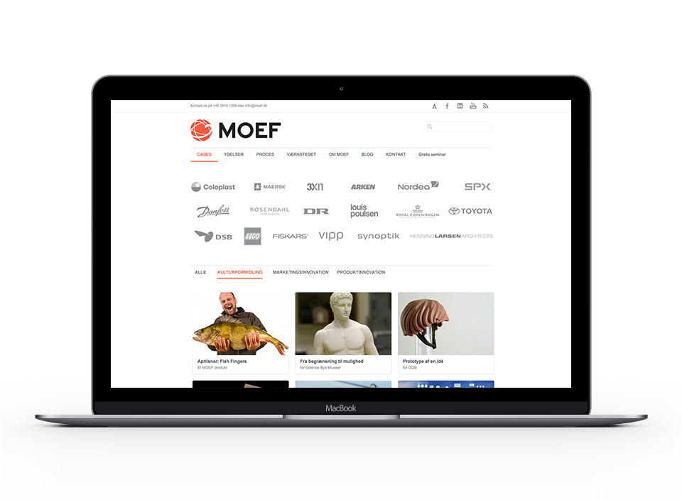
MOEF website
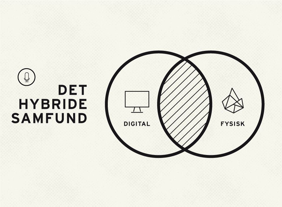
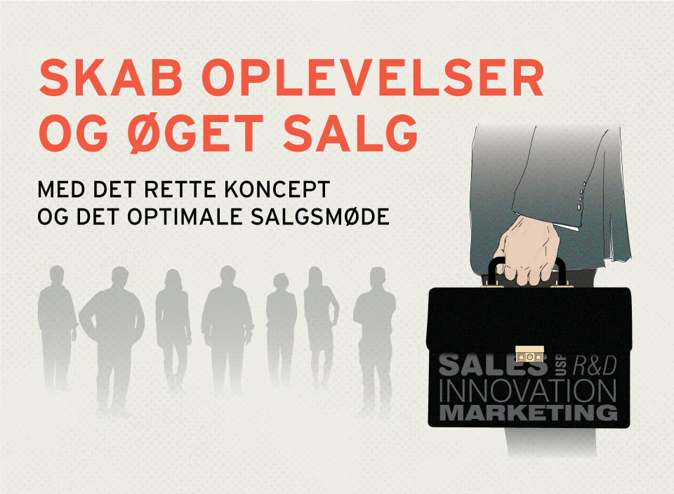


Example on illustrative content marketing visuals used for newsletters, e-papers, podcast etc.
Typographic element
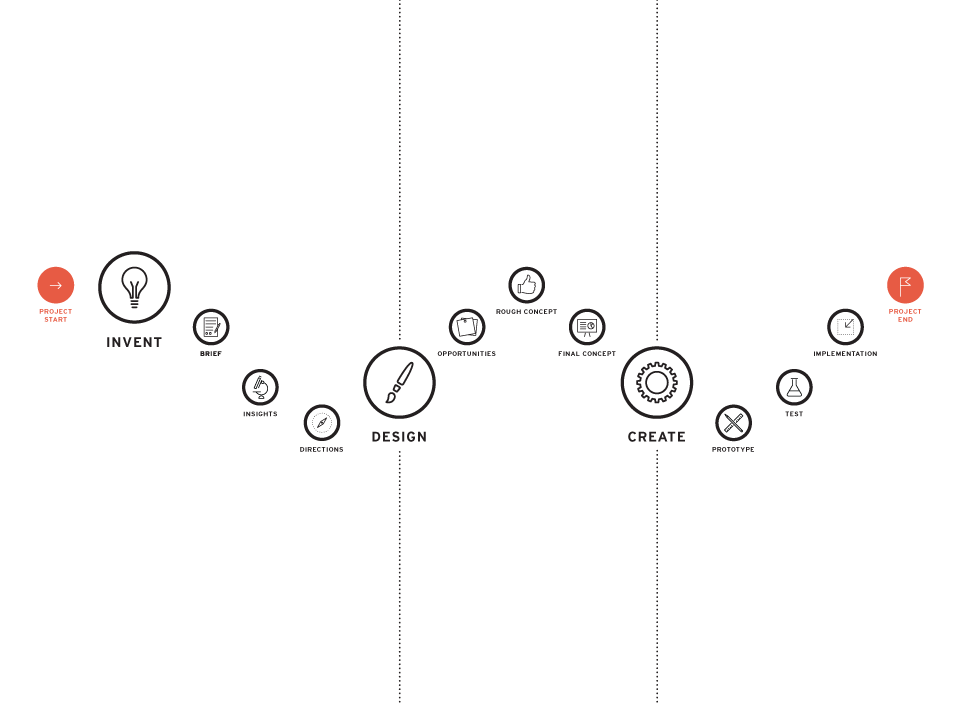
Framework for project management

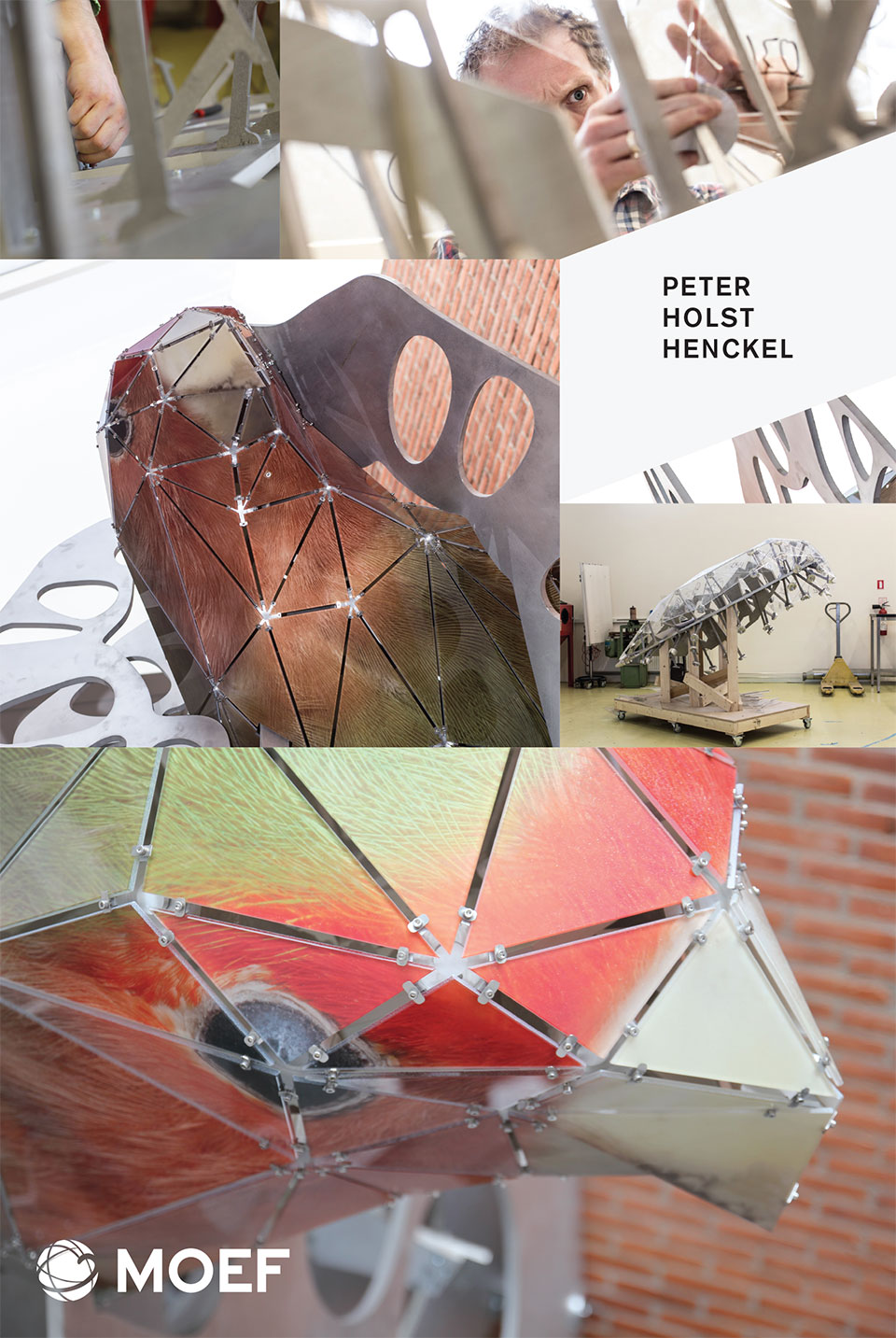
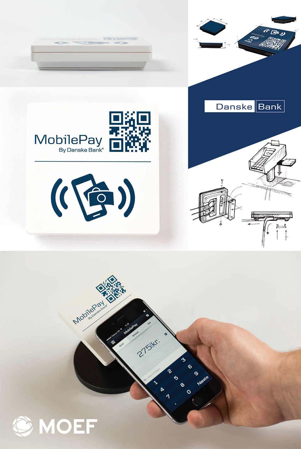
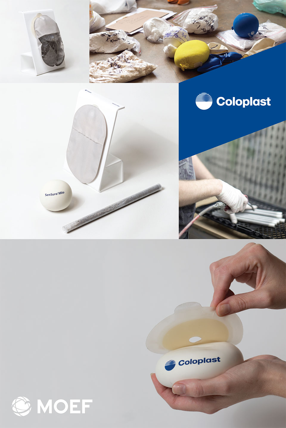
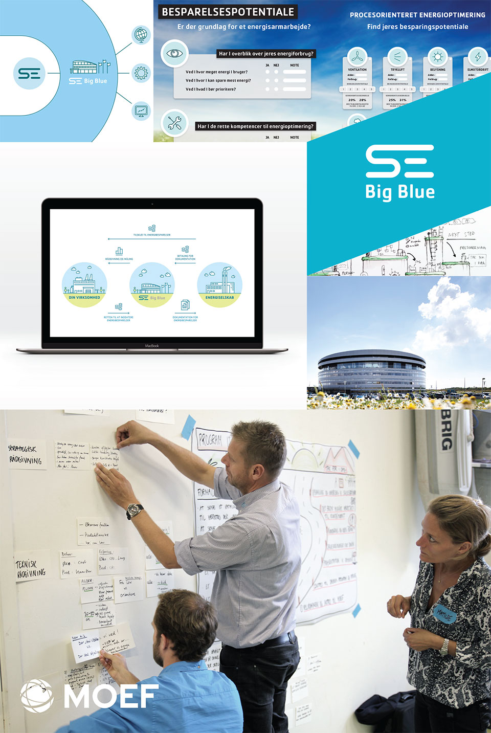
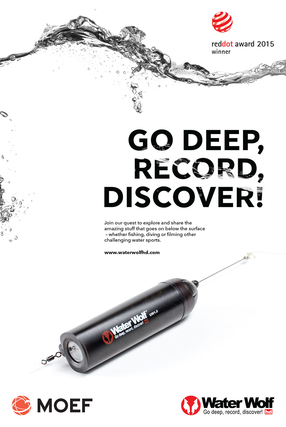
Case presentation posters
![]()
![]()

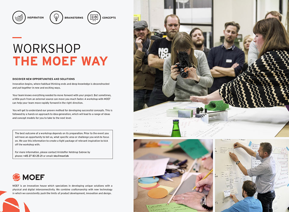
Stationary and marketing materials